Cards Module
The cards module is responsible for displaying data in a card format.
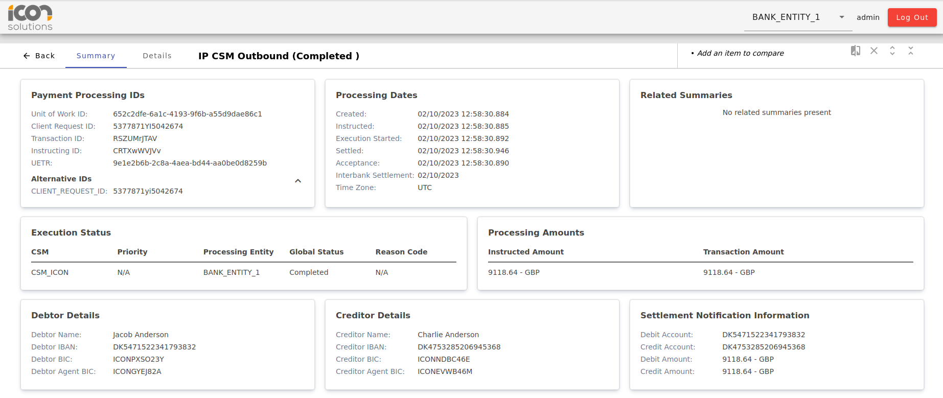
An example of the cards being used can be seen in the ods module, on the payment search summary page.
Card
The card component is used to create a collapsable card. It has a title and content section.
| Name | Description |
|---|---|
@Input() isExpandable: boolean (default: false) |
Whether the card should be expandable and collapsable by the user. |
@Input() isExpanded: boolean (default: true) |
Whether the content should be expanded or collapsed. This will be ignored if |
<ipf-card [isExpandable]="true" [isExpanded]="false">
    <ipf-card-title>Title</ipf-card-title>
    <ipf-card-content>Content here</ipf-card-content>
</ipf-card>
Card Page Title
A component to be used on a page that uses multiple cards. It will display the title as a <H1> tag and create buttons for any actions you supply. When an action is clicked, the component emits the action that was triggered.
| Name | Description |
|---|---|
@Input() title: string |
The title to be displayed in the component |
@Input() actions: CardPageTitleAction |
Actions to be displayed along side the title. |
@Input() navLinks?: BreadcrumbNavLink[]; |
Navigation items to be used for the breadcrumbs |
@Output() actionClick: EventEmitter<CardPageTitleActionEvent> |
Event that is fired when an action is clicked. |
    let actions: CardPageTitleAction[] = [
        { id: 'edit', name: 'Edit', colour: 'primary' },
        { id: 'view', name: 'View', colour: 'primary' },
    ];

    let navItems: BreadcrumbNavLink[] = [
        { link: ['../..', 'test', 'view'], title: 'Test'},
        { link: ['../..', 'test', 'edit'], title: 'Test2'}
    ]

    actionClick(event: CardPageTitleActionEvent): void {
        console.log(event);
    }
<ipf-card-page-title title="Title" [actions]="actions" [navItems]="navItems" (actionClick)="onActionClick()"></ipf-card-page-title>Grid List Card
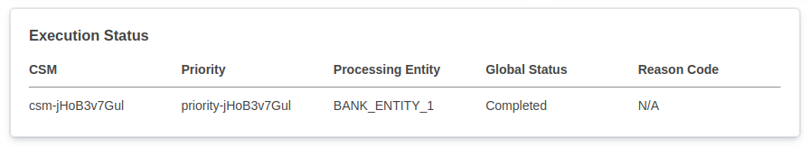
The grid list card displays data in a table like format, with headings and columns, however it can only have one row. An example can be seen below.
| Name | Description |
|---|---|
@Input() title: string |
The title to be displayed on the card. |
@Input() itemList: ListCardItem[] |
The list of items to be displayed on the card. |
@Input() missingValueString: string |
The string to be displayed when a value is missing. |
<ipf-grid-list-card
    missingValueString="N/A"
    data-testid="execution-status-info"
    [title]="Execution Status"
    [itemList]="executionStatusList"
></ipf-grid-list-card>
Expandable List Card
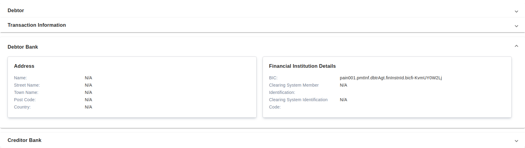
The expandable list card displays groups of list cards in expandable sections.
The first section in the list will start expanded.
| Name | Description |
|---|---|
@Input() sectionList: ExpandableListCard |
The title to be displayed on the card.
|
<ipf-expandable-list-card [sectionList]="sectionList"></ipf-expandable-list-card>List Card
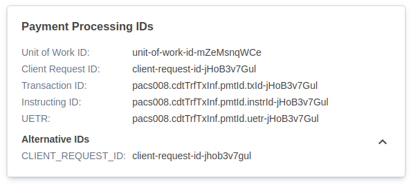
The list card displays data in a list format, with a key and value for each item. An example can be seen below.
| Name | Description |
|---|---|
@Input() title: string |
The title to be displayed on the card. |
@Input() noDataText: string |
The string to be displayed when there is no data for the List Card. |
@Input() noSectionItems: string |
The string to be displayed when there is no data for a sub-section of data below a subtitle within the List Card. |
@Input() itemList: ListCardItem[] |
The list of items to be displayed on the card.
|
@Input() missingValueString: string |
The string to be displayed when a value is missing. |
@Input() actions: ListCardActions[] |
The list of actions that will be added to the top of the card. These will emit the given string when clicked.
|
Example usage:
<ipf-list-card
    class="info-box"
    missingValueString="N/A"
    data-testid="debtor-agent-info"
    [title]="Debtor Agent"
    [itemList]="debtorAgentList"
    [actions]="approvalActions"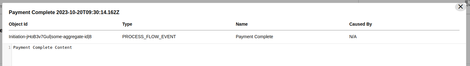
></ipf-list-card>Table Card
The table card displays data in a table like format, with headings and columns, similar to the grid list card, however the table card can have more than one row. An example can be seen below.
| Name | Description |
|---|---|
@Input() title: string |
The title to be displayed on the card. |
@Input() columns: string[] |
The columns to be displayed on the card. |
@Input() rows: TableCardRow[] |
The rows to be displayed on the card. |
@Input() missingValueString: string |
The string to be displayed when a value is missing. |
| The values in the title, columns and missingValueString inputs will need to be translated using transloco. |
Example usage:
<ipf-table-card
    missingValueString="N/A"
    data-testid="payload-dialog-table"
    [title]="data.title + ' ' + data.createdAt"
    [columns]="[t('objectId'), t('type'), t('name'), t('causedBy')]"
    [rows]="tableRows"
></ipf-table-card>
Summary Card
The summary card is for highlighting an individual piece of information. An example can be seen below.

| Name | Description |
|---|---|
@Input() title: string |
The title to be displayed on the card. |
@Input() summary: string |
The summary be displayed on the card. |
Example usage:
<ipf-summary-card
    [title]="'Status'"
    [summary]="'Allocated'"
></ipf-summary-card>