Grafana
IPF Metrics Processor produces business metrics in a Prometheus format. How you choose to visualise these metrics is up to you, but Grafana is recommended. See the Prometheus Grafana Support documentation for more information.
A basic out-of-the-box Grafana dashboard does it exist, but is actually intended to be more of a starting point for building your own dashboards.
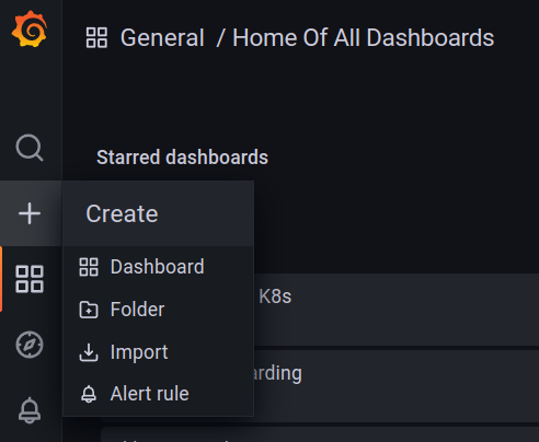
Configuring your first Dashboard
This is not intended to be a guide to Grafana, please see the official documentation for that. This is a simple guide to create a graph from the metrics produced by IPF Metrics Processor.
Grafana must be configured with a Prometheus datasource, and that Prometheus instance must be scraping the IPF Metrics Processor prometheus endpoint.
Configure the graph query
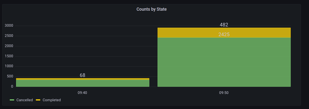
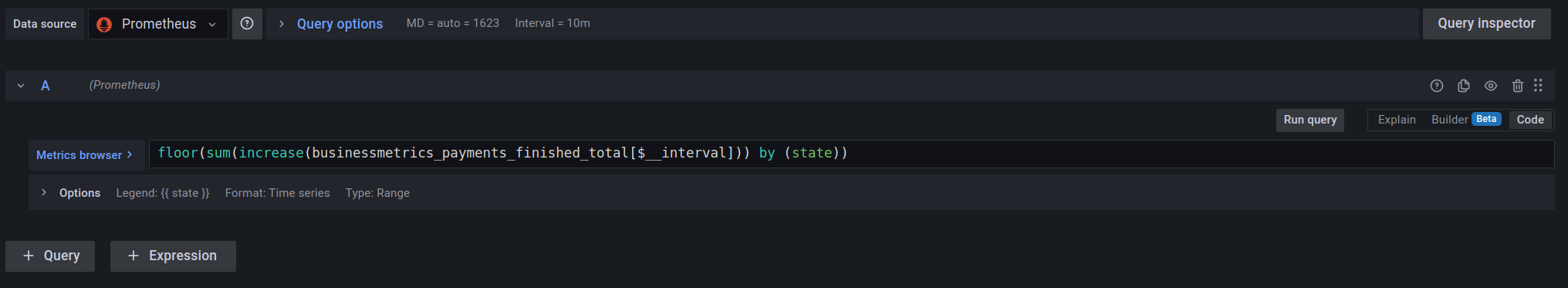
For this we’ll use the businessmetrics_payments_finished_total metric, and for added complexity we’ll also group those counts by the final state of the payment, e.g. Cancelled or Completed, and visualise as a stacked bar chart.
The graph shows the number of Completed vs Cancelled payments in ten minute buckets.
The datasource for the query must be Prometheus.
In the metrics browser input field, put floor(sum(increase(businessmetrics_payments_finished_total[$__interval])) by (state)).
$__interval is a built-in Grafana variable that in this case represents the size of our buckets. We want this to be ten minutes, so under "Query Options" choose the "Min interval" to be 10m.
Under "Options" set the "Legend" to a custom value of {{ state }}
Configure the graph type
Choose "Bar chart", and set "Stacking" to Normal. You may also wish to configure the colours for the different legend values, e.g. red for Cancelled, and green for Completed. If there are more terminal states, choose appropriate colours, so they can be easily distinguished when stacked with others.
Give the panel a title, e.g. "Counts by State".
Click "Apply", resulting in…